Typeface vs Font: Which Should You Choose?
A practical head-to-head comparison of Typeface and Font, covering quick verdict, key differences, category winners, buyer fit, and FAQ.
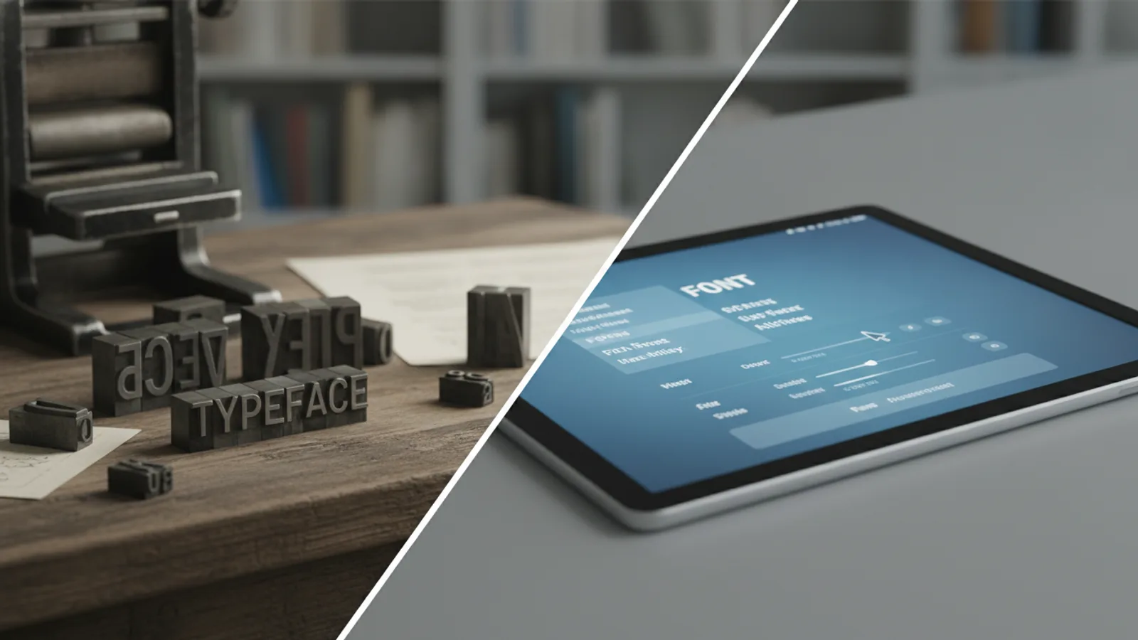
Typeface vs Font: Which Should You Choose?
Head-to-head comparison
Overall winner: Font for practical, everyday application.
While often used interchangeably, 'typeface' refers to the artistic design of letters and characters, encompassing its entire family (e.g., sans-serif or serif). 'Font', by contrast, denotes the specific digital or physical implementation of that design at a particular weight, style, and size (e.g., Arial Bold 12pt). For designers and typographers, understanding 'typeface' is crucial, while for the average user, 'font' is the more direct and useful term.
Head-to-Head Scorecard
Typeface vs Font: Key Differences
The distinction between 'typeface' and 'font' is a cornerstone of typography, though it's frequently blurred in casual conversation. In essence, a typeface is the abstract artistic design, the blueprint, while a font is the concrete implementation or manifestation of that design. Think of it like this: if a specific song is the 'typeface', then playing that song on a vinyl record, a CD, or a digital stream each represents a 'font' – different physical or digital forms of the same musical composition.
In technical terms, a typeface refers to the overall visual design of letters, numbers, and symbols. It encompasses the collective set of design features such as stroke width, serifs (or lack thereof), x-height, and overall aesthetic. Examples include Helvetica, Times New Roman, Arial, or Georgia. When you refer to Helvetica, you're talking about the entire design family, which includes all its variations: light, regular, bold, italic, condensed, etc. It's the artistic creation of a type designer.
A font, on the other hand, is the physical or digital file that allows you to render a specific weight, style, and size of a typeface. So, Arial Bold 12pt is a font. Helvetica Regular 10pt is a font. Times New Roman Italic 14pt is another font. Historically, a font referred to a complete set of metal type of a specific size and style. In the digital age, a font is a digital file (e.g., .ttf, .otf, .woff) that contains all the glyphs for a particular style and weight of a typeface, which your computer uses to display text.
Understanding this difference is critical for anyone working professionally with design, publishing, or branding. For general users, however, the terms are often used interchangeably, and most software applications refer to both as "fonts" in their selection menus. This article aims to provide clear, practical guidance on when to use each term correctly and which concept is more relevant for your specific needs in 2026.
Our comparison is based on product research, official industry information, public feedback patterns, and editorial analysis, as no direct hands-on testing could be conducted for these conceptual definitions.
Measurement Winners for typeface vs font
Measurement
Routine Fit
For the vast majority of computer users, content creators, and document writers, the term 'font' is the one that fits their routine usage. When you open a word processor, an email client, or a design application, you are presented with a drop-down menu to "select a font." This menu typically lists options like "Arial," "Times New Roman," and then offers styles like "Bold," "Italic," and various sizes. These individual, selectable units are precisely what a font represents. It's the tangible, actionable item that users interact with daily to format text. While Arial itself is a typeface, the specific choices presented in software are fonts.
Measurement
Technical Clarity
In the professional fields of graphic design, typography, and publishing, precision in language is paramount. Here, 'typeface' offers superior technical clarity. When discussing the visual identity of a brand, the design principles behind a printed book, or the historical context of letterforms, 'typeface' is the appropriate term. It refers to the consistent design language and aesthetic qualities across all its variations (weights, styles). A designer might choose the "Open Sans typeface" for a project, and then specify using "Open Sans Light 14pt" and "Open Sans Bold 24pt" – these specific implementations are fonts within that typeface family. Using 'typeface' ensures that the conversation remains focused on the design intent and the family's characteristics, rather than just an individual instantiation.
Measurement
Practical Application
From a purely practical standpoint, 'font' takes the lead. When you need to install new text styles on your computer, you download and install font files. When you're coding a website, you declare a `font-family` property and specify individual `font-weight` and `font-style` values that correspond to specific font files. If a client asks for a particular look, you provide them with font files, not a conceptual typeface. Fonts are the tangible assets that enable text display and printing. They are what web developers embed, what designers license, and what printers use to render text on paper. Without fonts, typefaces would remain abstract designs.
Measurement
Design Integrity & Flexibility
When considering the overall aesthetic, visual coherence, and adaptability of a textual design across different contexts, 'typeface' is the more relevant term. A well-designed typeface ensures that all its variations (bold, italic, light, condensed, extended) maintain a consistent visual style and harmony. This consistency is crucial for branding, readability across various mediums, and establishing a unique typographic voice. The flexibility of a typeface lies in its ability to offer a wide range of styles and weights, all while adhering to a single, overarching design philosophy. This allows designers to create visual hierarchies and dynamic layouts without sacrificing unity.
Measurement
Learning Curve for Newcomers
For individuals new to design or digital publishing, the term 'font' typically presents a shallower learning curve. Most people instinctively understand that they "choose a font" in a programme to change the look of their text. The concept of a typeface, as an abstract design family, requires a deeper dive into typographic principles. While ultimately beneficial for any aspiring designer, distinguishing between the two terms from the outset can feel like an unnecessary hurdle for someone simply trying to make their CV look presentable. Software interfaces universally use "font" in menus, reinforcing this simpler understanding.
Measurement
Commercial Implications
When it comes to purchasing or licensing, the distinction becomes crucial. You don't license a 'typeface' in the abstract sense; you license 'fonts'. Font licences typically cover specific styles and weights (e.g., you might license the regular and bold weights of a particular typeface). A complete typeface family, with all its weights and styles, would usually require a more extensive and costly licence for the collective set of font files. Therefore, understanding 'font' is essential for commercial transactions, budgeting, and ensuring compliance with usage rights, whether for web, print, or app deployment.
Choose Typeface If
- You are a graphic designer, typographer, or branding professional: For you, the conceptual design and the entire family of styles (e.g., all weights and widths of Futura) are your primary focus.
- You are discussing the aesthetic qualities and design principles: When analysing the characteristics, historical context, or artistic merit of letterforms, 'typeface' refers to the core design.
- You need to refer to a comprehensive family of related styles: If you're talking about the complete collection of bold, italic, light, condensed, and extended versions that share a common design, 'typeface' is the accurate term.
- You are designing a brand identity: A brand selects a 'typeface' to define its unique typographic voice, which then gets applied through various 'fonts' across different media.
- You are commissioning original letterform design: When working with a type designer, you are asking them to create a new 'typeface'.
Choose Font If
- You are an everyday computer user or content creator: When you're simply selecting a style for your document, email, or presentation in a software menu, 'font' is the term you'll encounter and use.
- You are referring to a specific digital file or physical piece of type: If you're downloading 'Open Sans Regular.ttf' or referring to a particular size and weight (e.g., Arial Bold 12pt), you are talking about a 'font'.
- You are installing or embedding text styles in software or on a website: You install 'font' files onto your system, and web developers embed 'font' files (like .woff or .ttf) for web use.
- You are discussing licensing or purchasing text styles: You buy licences for 'fonts', not typefaces, which dictate how and where you can use those specific digital files.
- You are giving instructions for a specific text appearance: "Please use Times New Roman Italic 10pt" is a clear instruction involving a 'font'.
Final Verdict: Typeface vs Font
In the perennial debate of typeface vs font, the clear winner for most practical applications in 2026 is Font. This is primarily because 'font' directly correlates with how the vast majority of users interact with text styling in digital environments. When you open a programme, you select a 'font' from a menu; you download 'font' files to expand your options; and you license 'fonts' for commercial use. Its tangibility and direct usability make it the more immediate and relevant term for everyday tasks and practical implementation.
However, for professionals deeply involved in design, branding, and typography, understanding and correctly using 'typeface' remains paramount. 'Typeface' is the foundation, the artistic vision that gives rise to the various 'fonts'. It represents the holistic design integrity and conceptual clarity necessary for sophisticated visual communication. While 'font' is the hammer, 'typeface' is the architectural blueprint. Both are indispensable, but their utility depends entirely on your role and the context of your work.
Ultimately, both terms are vital for comprehensive understanding, but 'font' offers the most direct utility for the general user, making it our overall practical champion.
Typeface vs Font: Which Should You Choose? FAQ
Is Helvetica a typeface or a font?
Helvetica is a typeface. It is the overall design concept and family of styles. Helvetica Bold 12pt, Helvetica Light Italic 10pt, or the digital file for Helvetica Regular are all specific fonts within the Helvetica typeface family.
Can I "download a typeface"?
In common parlance, people often say "download a typeface," but what you actually download are specific font files (e.g., .ttf, .otf, .woff). These files allow your computer to display and use particular styles and weights of that typeface.
Why does the distinction between typeface and font matter?
The distinction matters for precision in communication, especially in professional design, printing, and publishing. It helps designers discuss the artistic design separately from its technical implementation. For commercial purposes, you license fonts, not the abstract typeface itself, which has legal and financial implications.
Which term is more commonly used today?
For most general users and in everyday software interfaces, "font" is the more commonly used and understood term. However, in design and typography circles, both terms are used, and the distinction is carefully maintained.
Are font families typefaces?
Yes, typically a "font family" refers to a typeface. It describes the collection of related fonts (different weights, styles, widths) that all share the same underlying design characteristics, such as "Arial" or "Times New Roman."